Oh dear! It's really inconvenient when the truth gets in the way and blows your argument to bits, isn't it? Not a word of rebuttal; not shred of evidence presented, only more of the, "world according to The Horseman".
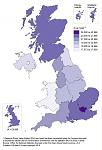
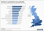
By coincidence, I came upon some relevant charts and graphs when I was reading
Paul Kavanagh's blog this morning. Here are just two of them (click on the image to enlarge).
1. Map showing where revenue is generated in the UK.
2. Map showing where the UK's wealth ends up
By all means take issue with these charts but please provide some evidence to back up what you write.


 Reply With Quote


Bookmarks